Εμφάνιση αναρτήσεων με ετικέτα logo. Εμφάνιση όλων των αναρτήσεων

Πέμπτη 7 Νοεμβρίου 2024

Logo and branding for Sifnos Wood Art


Branding: Dimitris Klonos
Client: Sifnos Wood Art

In this project I was asked to create a logo for Sifnos Wood Art. Nikos Livas is a professional woodworker and artist based on the Greek island of Sifnos. I tried to create a logo to express all the stuff he does on his work. In the picture you can see the basic guide lines of the logo and a few basic branding applications. 

Τετάρτη 16 Οκτωβρίου 2024

Logo and brand identity for Phytotesing


Branding: Dimitris Klonos

For this project I had to create a logo and brand identity for Phytotesing. Phytotesting is a company that deals with scientific research and agriculture. So I came up with the logo concept having it's origins on the DNA helix but also on a plant visual. 

Δευτέρα 14 Οκτωβρίου 2024

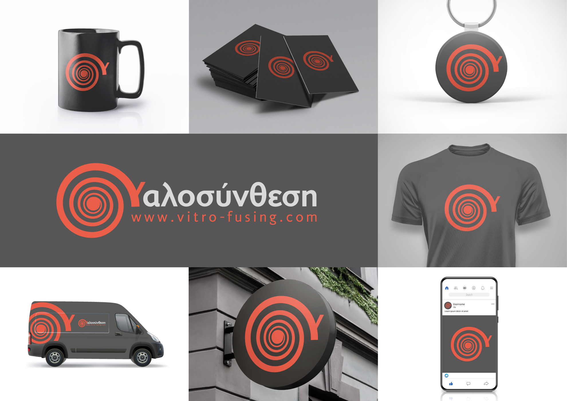
Logo and brand identity for Yalosinthesi


Branding: Dimitris Klonos

Yalosinthesi is a company that works with glass. They use different techniques including glass. The spiral is a pretty common visual used in their work, so I tried to incorporate that into their brand identity. 

Logo and branding for Dielectrics Group


Branding: Dimitris Klonos

On this project I had to expand the logo to a whole bunch of different branding elements. The Dielectrics Group, is a team of scientists from National Technical University of Athens, that deals with dielectric materials.

Τρίτη 1 Οκτωβρίου 2024

Creating logo and brand identity for Greek Woodturning Team


Art Director: Dimitris Klonos
Branding: Dimitris Klonos

Greek woodturning team is a group of people that create beautiful items out of wood, using the lathe as their main tool. I was called to create a logo for the team. The logo had to be clean, specific and flexible so it can be applied in many different situations. It's been a couple of years since the logo was released. So far it seems to fit the needs of the team really nicely. So, I can call it a winner!

Τετάρτη 25 Σεπτεμβρίου 2024

Logo and brand identity for a dentist


Art Director: Dimitris Klonos
Branding: Dimitris Klonos
Client: Eirini Fothiadaki

I created this logo and brand identity, using smooth colors and simple layout. I wanted to get the medical look with an essence of calmness and also modern aesthetics. 

Πέμπτη 29 Αυγούστου 2024

Logo and business card for a Stairmaker


Art Director: Dimitris Klonos
Logo design: Dimitris Klonos
Client: Fotis Kalovedouris


On this project I had to create a logo and a business card for Fotis Kalovedouris. Fotis makes wooden stairs. I took advantage of the letter "Φ". Φ is the letter that represents the golden ratio and it is also the first letter on Fotis's name. So I created a spiral close to a "Φ" only with stairs. 

Τετάρτη 28 Αυγούστου 2024

Logo design for "Δελφική Γη"


Art Director: Dimitris Klonos
Logo design: Dimitris Klonos

I was asked to create a logo for a brand that produces olives coming from the lands of Delphi. So I created the logo based on an olive tree that rotates trying to follow the sun light.


Παρασκευή 29 Μαΐου 2020

Logo and business cards for Katerina


Art Director: Dimitris Klonos
Logo design: Dimitris Klonos
Client: Katerina Hatzixrisou

Katerina creates wedding and baptism decorations and accessories. I create a logo based on her name her favorite flower. 

logo sticker and T-shirt for Annikas


Art Director: Dimitris Klonos
Logo design: Dimitris Klonos

My friend Kostas Annikas is a Greek woodturner and craftsman based on Kefalonia island. He creates beautiful works of art out of wood and also sells tools and accessories for woodturners.  

I used his original logo, his face, the map of Kefalonia and two really distinct woodturning tools, to create a modern logo for him.

Σάββατο 23 Ιανουαρίου 2016

Logo and guidelines for "Thessalia" butcher shop


Art Director: Dimitris Klonos
Logo design: Dimitris Klonos

I was asked to create a logo for the traditional butcher shop "Thessalia".

The logo is based in the aesthetics of etching in order to express the fact that the shop is traditional and has a history of many years.

I have also added elements that express the origins of it's brand name which is  Thessalia area in Greece. I have also added the basic tools of a butcher shop.

Because the logo is fairly complicated I have also created a simpler version of it, in order to cover many cases in it's application.

Πέμπτη 24 Σεπτεμβρίου 2015

Redesigning Giaola logo for special days


Art Director: Dimitris Klonos
Logo design: Dimitris Klonos

Giaola needed to make special logos for special days of the year. 

To do that we first needed a design strategy. So we decided that we would keep the main forms of giaola but we would add design elements that are in line with the aesthetics of the logo.

We also added a relevant page to giaola brand manual.


I also add the original giaola logo.


This is a process that goes on until today. 

For a creative graphic designer, designing signs is very interesting job and opens up great creative opportunities.


Δευτέρα 4 Μαΐου 2015

Logo and packaging for Pythio olive oil


Art Director: Dimitris Klonos
Logo and guidelines: Dimitris Klonos
Packaging design: Dimitris Klonos
Realistic packshot illustration: Dimitris Klonos
Client: Pythio

It is always a challenge to create for a new brand. In this case I had to design the logo and packaging  for the extra virgin olive oil Pythio. 

Pythio is coming from the well-known olive grove of Amfissa, one of the biggest continuous olive groves of Greece. 

The name come from "Pythia" the famous oracle of Delphi. As a result the logo is inspired from the Greek mythology of the oracle after studying the art of that era.

The overall packaging design is simple trying to focus on the logo and the olive colors.

It was a pleasure to design for such an extraordinary product.

Τετάρτη 7 Ιανουαρίου 2015

Logo for the Dielectrics Group of NTUA


Graphic design: Dimitris Klonos

The Dielectrics Group of the National Technical University of Athens (NTUA) in Greece, works with main focus on the study of the structure-property relationships in polymers and biopolymers. Research into this field has been proceeding for more than 25 years in Athens in close cooperation with several universities and research centers worldwide, in particular in Europe. The group has contributed to over 200 refereed journal papers and numerous conference contributions.

After a brief conversation with a member of the DG group about their work I started having some thoughts on what forms or symbols might be relevant for a logo like that. 

The final logo has two main versions a portrait and a landscape one. The sign has 3 dominant features. Fist of all the "D" "G" initials that are bound together like a chain. Second feature is the capacitor symbol on the "D". Third is the color, I use a blue tone which matches with the DG group's website colors.

You can also view the basic guidelines of the logo, the colors, negative and positive and the basic safe area.

Τρίτη 27 Μαΐου 2014

Logo design and website art direction for Phyto Testing


Art Director / Graphic Designer: Dimitris Klonos
Web development: iarts

Phyto Testing Services Ο.Ε. (PTS) has been established in 2011 in order to offer a range of cotton breeding and variety evaluation services.

As a result the logo and brand identity had to combine nature with science. We've used the green color of fresh leaves as the main brand color and the DNA/ growing plant symbol in order to express the brand's purpose.

The website is simple and clean in order to be easy for the viewer to navigate through the pages and find out more about the company.

Τρίτη 22 Οκτωβρίου 2013

Douwe Egberts instant coffee with flavours Poster


Art Director: Dimitris Klonos
Copywriter: Katerina Androuli, Eleni Stamataki
Creative Director: Catherine Chryssanthacopoulou
Advertising agency: LOWE ATHENS
Client: Douwe Egberts

This is a poster that contains the main visual elements of big campaign which was created for the Greek market, in order to communicate the revolutionary Douwe Egberts instant coffee with flavours. We created a revolutionary logo and along with the colours (which represent the flavours) we tried to establish a strongly branded visual experience. 

Another equally strong creative element of the campaign was the language and copy in general that was used. In this poster you see just bits of that. In the posts that follow you will be able to have a better taste of this element to.

IPE logo redesign-refreshment and logo guidelines manual


Graphic design: Dimitris Klonos
Advertising agency: LOWE ATHENS
Client: IPE

This is a logo redesign plus refreshment case. The client is "Ινστιτούτο πωλήσεων Ελλάδας". I have also created  a guidelines manual. This way every graphic designer that has to do something with this logo, knows how to handle it the propper manner.